Financial literacy is crucial to young people's future. But how financially literate are young people today, and how can they prepare for the economic challenges of tomorrow? To answer these questions, we interviewed Jessica Thyrion, advisor at the ABBL Foundation for Financial Education. In this article, she shares her expertise on the importance of financial education, the specific challenges facing young people, and the initiatives in place to help them navigate the complex world of finance. Find out how the ABBL Foundation is working to improve young people's financial literacy and prepare them to make informed and responsible decisions.
The importance of innovative design in the banking sector
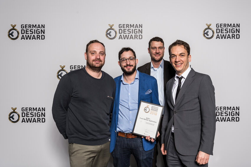
Spuerkeess recently redesigned the desktop and mobile versions of its S-Net. The modern and innovative design created by the communications agency Apart won a “German Design Award” 2018 in the “Excellent Communications Design – Apps” category.
Claude Folschette: We always suggest to our clients that we begin an interface project with a discovery phase. This phase enables us to better understand the challenges and constraints from the client and user point of view. It is only in the second stage that we return to the application’s structural and functional details, while always keeping in mind both our client’s expectations and the needs of the end customer.
Next comes the design phase, which begins with a lot of back and forth between our customer, here Spuerkeess, and us, the agency. Based on these discussions, we designed several models, which, once accepted, were sent to the bank’s developers. For S-Net mobile, the design phase also involved several tests under real conditions. For instance, we created a prototype to validate specifically the navigation quality in the application. We also tested several navigations before adopting a final version.
The application design acted as a basis for the design of the identity of Spuerkeess’s digital brand. Colours, typography, iconography, grid system, … We started everything from scratch. Today, we have a complete mobile and desktop style guide, including more than 166 components and nearly 600 unique elements, ensuring a coherent experience on all of Spuerkeess's digital supports.
For this new S-Net Mobile version, we wanted to reverse this logic and highlight customer experience. This is why we delegated the design aspect to a specialised communications agency, which was independent from us and from technical specificities. The aim was to reach an innovative design that enables the quick execution of daily tasks such as opening the application, viewing account information or making transfers.
Two years on from its launch, S-Net Mobile has become an indispensable tool for our digital customers. With more than one million connections a month, our customers confirmed that we made the right decision. Thanks to an innovative design and a focus on ease of use, S-Net Mobile accompanies our customers on a daily basis, and thereby reflects our key values, which are customer focus and the efficiency of our digital products.
Claude Folschette: On some projects, we love to be very creative or even disruptive in terms of experience, but with a project like Spuerkeess’s web-banking application, we had to remain alert, because the end user audience is extremely large. The application had to be accessible to as many people as possible, and this, regardless of the public's comfort level with technology. Reinventing the wheel was not an option, we had to be creative while complying with best practice in the applications field!
TweetIt is the user who controls the application, not the application that controls the user.
Claude Folschette - Apart
The documentation offered by the two large mobile operating systems, iOS and Android, is of great help in these kinds of situations. iOS and Android create some really instructive documentation. The "Human Interface Guidelines", as Apple and Google like to call them, enable designers and developers to create applications that are increasingly functional and in line with the most widespread uses. Following these guidelines is an extremely rigorous process. This work is made all the more complex when a new digital brand has to be developed in parallel, as it was the case with the creation of the Spuerkeess web-banking application.
- Using the visual aesthetics as a means of highlighting the content and not vice versa. This results in a better understanding of the content.
- Always offering the user the necessary environment, but limited to the key points, no matter which screen they use and their point of entry.
- Structuring and ranking the content through a legible and pleasant typography combined with the judicious use of white space.
- Reducing the volume of content per view and encouraging the user to scroll. Scrolling has become a natural action that requires little effort from mobile users. The content is gradually revealed and the cognitive load reduced.
- Introducing a progressive, contextual and easily accessible navigation, thus enabling a rapid determination of its basic actions.
- Displaying short animations in order to introduce new “gestures”, enabling rapid actions such as delete, send, etc.
- Adding feedback after each user action, as for instance a micro-animation, a sound or a vibration.
- Integrating artificial intelligence such as voice or virtual assistance or even a chatbot within the interface.
TweetGenerally speaking, I would say that a good experience is one that is empathetic towards the user.
Claude Folschette - Apart