9th March 2020

In the spirit of continuity

Françoise Thoma, Chief Executive Officer of Spuerkeess, talks to us about the Bank’s new communications strategy.

New communication campaign, new Corporate Identity: what has led to this choice?

Our logo, which we still use today, was introduced in 1989, year that we adopted the name “Banque et Caisse d’Epargne de l’Etat, Luxembourg”.

We launched our last major branding campaign in 2006, year of the Bank's 150th anniversary. We also introduced the slogan “Äert Liewen. Är Bank” at that time. Since then, our communications with customers were primarily focused on products.

Today’s world is undergoing substantial changes, especially societal and economic changes. First of all, there have been considerable changes in Luxembourg’s demographics. Our population increased from 380.000 in 1990 to more than 600.000 in 2019, with almost half the population coming from outside the country. Digitalisation has also changed people’s habits and how they communicate.

Given these changes, we felt that it was time to rethink ourselves and analyse our position on the Luxembourg market. We engaged an external consultant and involved numerous employees in workshops that sought to define the attributes of our brand.

One thing however was clear from the beginning: “We won’t change the logo!” We wanted our evolution to stay true to our history without breaking with our identity, which is key in standing out from the competition. This is rooted in our DNA: we are not a “revolutionary bank”, but an “evolutionary bank”.

This decision was bolstered by Spuerkeess being voted the top bank and the second “favourite brand” across all brands nationally[1]. We decided to keep and emphasise those aspects that have allowed us to achieve this level of popularity. With this in mind, we tasked our Marketing Department with repositioning our brand.

What’s new in this branding campaign? How does it differ from campaigns in the past?

Starting in the early 2000s, our advertising campaigns focused primarily on our products. Back then, banks were differentiated primarily by their products and their terms and conditions. Since then, the banking sector has evolved towards increasingly interchangeable banking products.

Taking into account the growing demographic complexity and the requirements of digitisation, we believe that the dominant factor in standing out nowadays is the quality of service that we can offer our customers. Customers are looking for a contact person, a trusted partner who listens and is available to them. They want someone whose central focus is supporting them at the various stages of their life and meeting all their needs.


In our highly technological world, the human factor is therefore regaining its importance. That is what we have tried to incorporate it into our new advertising campaign and why our customers and advisers are the focus of our attention.

What are the main features of your new communications strategy?

First of all, we are clearly choosing a type of communication that highlights the Spuerkeess brand rather than, as I mentioned before, product-oriented communications. The names Banque et Caisse d’Epargne and BCEE are also being permanently replaced with the name Spuerkeess in all non-contractual communications. This has also been incorporated into our product range, where the Spuerkeess brand has been strengthened in relation to existing sub-brands (Axxess, Zebra, etc.). Customers will be able to see these changes gradually over the next few weeks.

It’s clear that, as a leading financial institution, Spuerkeess will always be able to offer customers the product that is suited best to their individual situation, ranging from opening an account, to entering into a car lease or subscribing to an investment product. These banking procedures are, however, often perceived as a necessity by many customers.

Behind this approach, though, lies our customers’ desire to implement significant projects throughout their lives, from purchasing their first home to starting their own business. These are dreams in themselves, thus strong emotions are naturally tied to them.

Our role in this is to act as a facilitator of these dreams.

Françoise Thoma

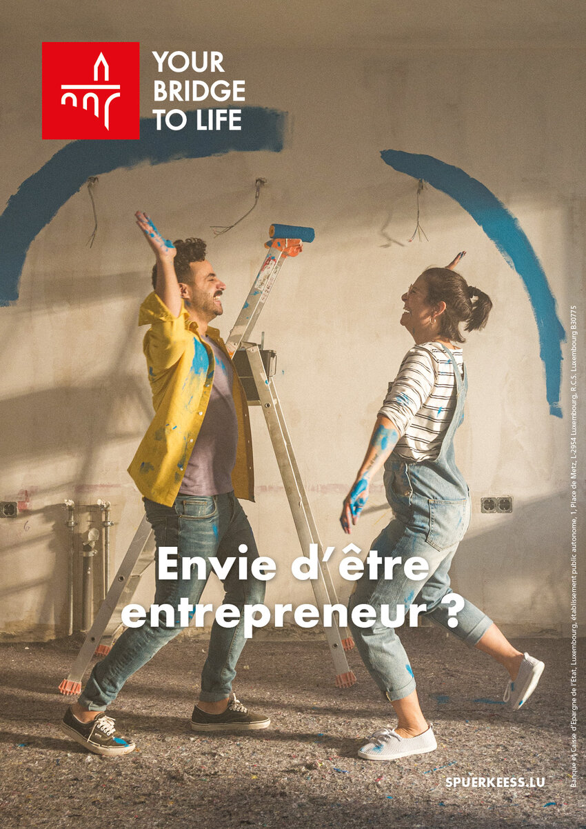
From a marketing perspective, this role of facilitator is symbolically incorporated into both our logo and our new slogan. Our logo includes the famous Adolphe bridge, a symbol that is deeply rooted in the history of both Luxembourg and our Bank. This bridge symbolises our desire to help customers overcome all obstacles standing in the way of their dreams. The logo is now paired with the new slogan “Your bridge to life”. We chose this English slogan to underline our openness to international customers, who have a growing presence in Luxembourg.

I’d like to conclude this interview with a wish: that our customers come to us not only out of necessity, but above all because they know that they are welcome. We’d like them to feel at home and know that we are there to support them. These strong emotions, along with an enjoyment of life and dreams, are reflected in our new commercial spot.

It’s also interesting to note that some of the actors are Spuerkeess employees. They are also the ones who make this campaign come alive.

Who knows? Maybe you’ll recognise one of them.

Discover the new campaign

[1] KPMG Luxembourg « Customer Experience Excellence Report 2019 »

You might also like

Innovation